
Client
UNIQA poisťovňa
Rebuilding a design system for clarity, accessibility, and scale
Design system
Accessibility
Problem
An outdated system that was hard to use and maintain
The existing design system had grown outdated and difficult to navigate for both designers and developers. It no longer contained all components used across current projects, and its structure did not reflect newer Figma features or the way designers worked in practice.
The existing design system had grown outdated and difficult to navigate for both designers and developers. It no longer contained all components used across current projects, and its structure did not reflect newer Figma features or the way designers worked in practice.
Because of that, the system became harder to maintain and less reliable as a shared source of truth. Designers had to spend more time searching, adjusting, or recreating components locally, which created a risk of inconsistency across projects.
Because of that, the system became harder to maintain and less reliable as a shared source of truth. Designers had to spend more time searching, adjusting, or recreating components locally, which created a risk of inconsistency across projects.
Process
Balance between complexity and everyday usability
One of the most important decisions was finding the right balance between flexibility and maintainability.
One of the most important decisions was finding the right balance between flexibility and maintainability.
A design system can quickly become too complex. Too many variants, nested components, or edge-case options may look powerful at first, but they often make the system harder to use in real project work. When that happens, designers start detaching components or creating local versions, and the system slowly loses its purpose.
A design system can quickly become too complex. Too many variants, nested components, or edge-case options may look powerful at first, but they often make the system harder to use in real project work. When that happens, designers start detaching components or creating local versions, and the system slowly loses its purpose.
The system was built with an atomic approach, but I was careful not to over-engineer the component structure.
The system was built with an atomic approach, but I was careful not to over-engineer the component structure.
Accessibility
Accessibility was not treated as a final check
Accessibility was one of the core principles of the new design system.
Accessibility was one of the core principles of the new design system.
As I defined the component structure, states, and documentation, I made sure accessibility was built into the foundations of the library, from visible focus states and sufficient contrast to usable target sizes and developer guidance.
As I defined the component structure, states, and documentation, I made sure accessibility was built into the foundations of the library, from visible focus states and sufficient contrast to usable target sizes and developer guidance.


Structure
Reorganized into a clear and easy to navigate structure
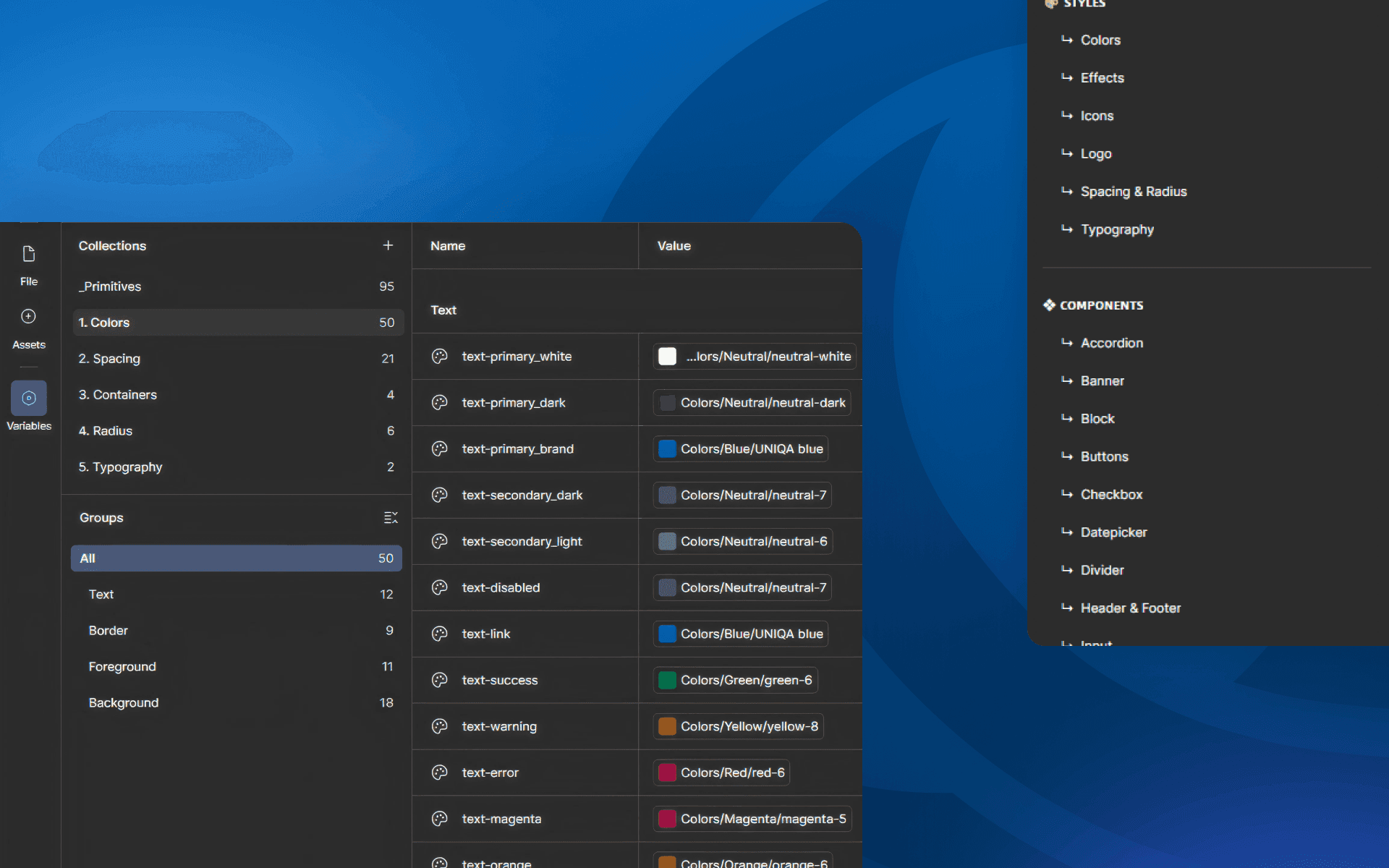
I reorganized the system into clear component categories, cleaned up outdated or duplicated elements, and used a more consistent naming structure. The goal was to help designers quickly find the right component, understand how it should be used, and avoid creating local versions outside the system.
I reorganized the system into clear component categories, cleaned up outdated or duplicated elements, and used a more consistent naming structure. The goal was to help designers quickly find the right component, understand how it should be used, and avoid creating local versions outside the system.
This made the library feel less like a collection of components and more like a reliable, easy-to-use working tool.
This made the library feel less like a collection of components and more like a reliable, easy-to-use working tool.

What changed
Practical tool for everyday design and development work
The new design system gave the team a clearer and more reliable foundation for future projects. It reflected the components currently used in production, used new Figma features, and made the library easier to navigate, maintain, and scale.
The new design system gave the team a clearer and more reliable foundation for future projects. It reflected the components currently used in production, used new Figma features, and made the library easier to navigate, maintain, and scale.
This project reminded me that a good design system is not the most complex one. It is the one people can actually use, trust, and maintain over time.
This project reminded me that a good design system is not the most complex one. It is the one people can actually use, trust, and maintain over time.